- 01
Read
A link, a paragraph, or an image you already like. Nothing has to be articulate — that is the part you came here for.
↳instagram.com/…/saved-collection“i make food videos. i want it to feel expensive but not cold. i don’t want the bright white kitchen thing everyone does.”
Reading - 02
Question
What we understood, handed back before anything is made. This is where you correct us, and it is the only place you have to decide anything.
You keep saving low-light, unstyled kitchens — never the bright overhead ones. Which of these is closer?
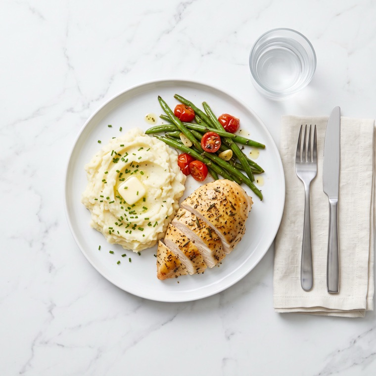
Bright, clinical, overhead 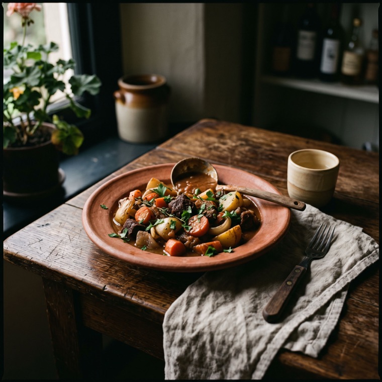
Low-light, unstyled, warm Composing direction
- 03
Direct
One direction, held as context from then on. References, palette, and the reasoning behind each call — including what to deliberately leave out.
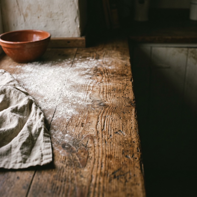
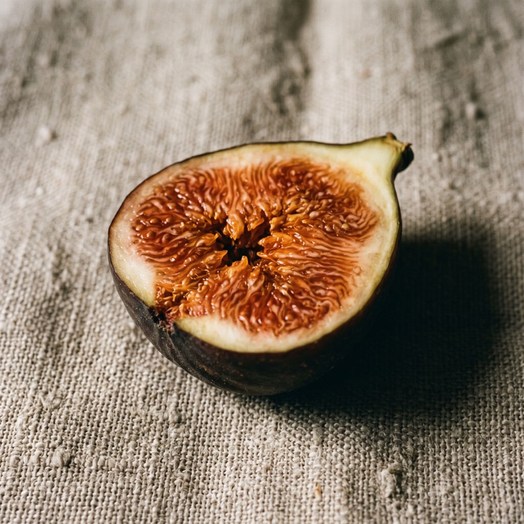
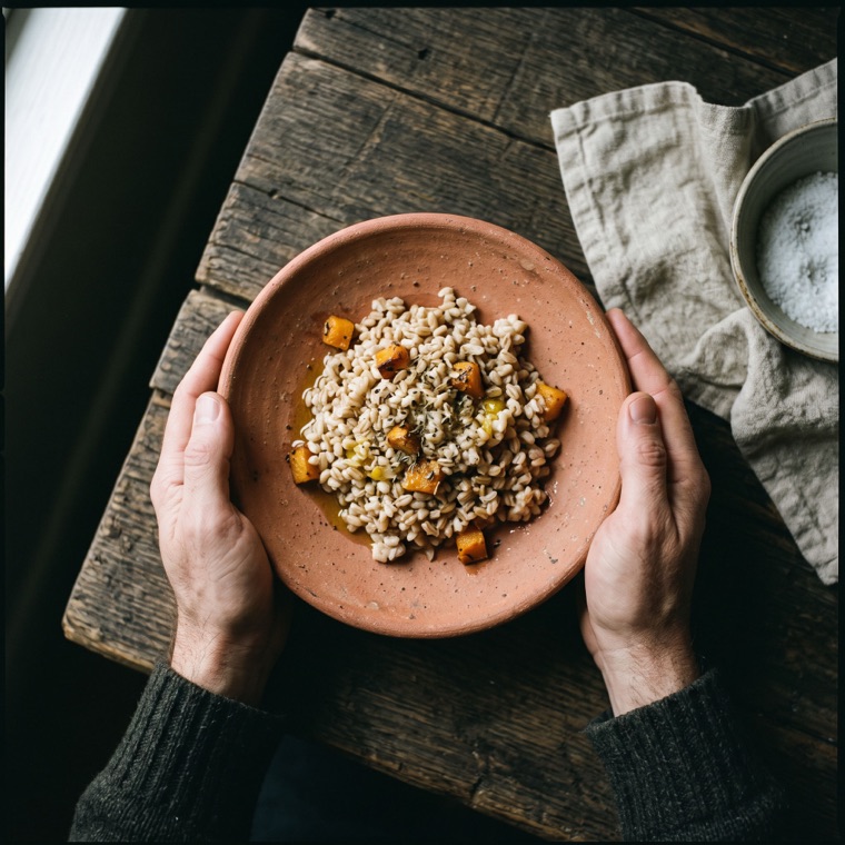
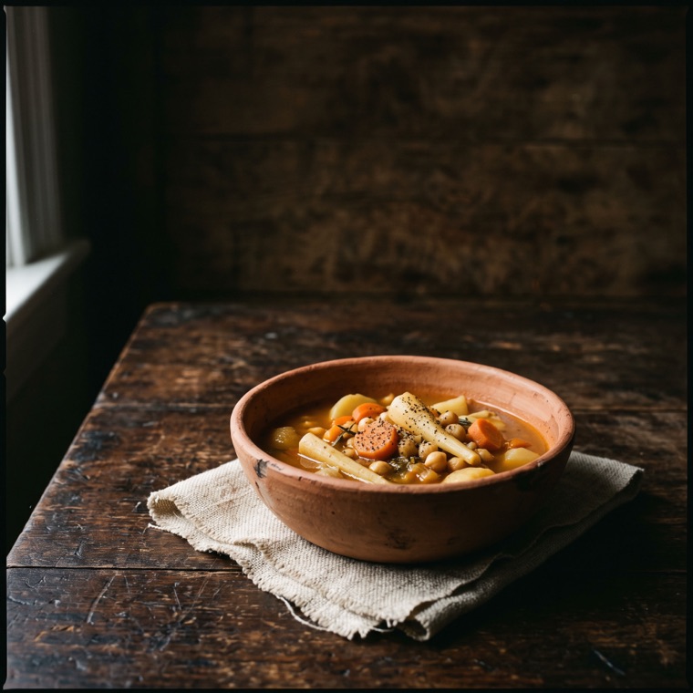
Palette
- Burnt clay#B0603F
- Raw linen#D5C9B2
- Bone#EDE4D5
- Ember amber#C98A45
- Night olive#2A2A22
Why
A working kitchen at the end of the day, not a styled shoot. The low window light and the unglazed terracotta are what make cheap ingredients read as considered — the marble and the overhead flat-lay are what make the whole category look the same.
One direction, argued for. Never a wall of ten options — choosing is the problem, not the product.
konseptual.ist — art direction as a system, not a style.
The direction above is an illustrative sample, not client work.